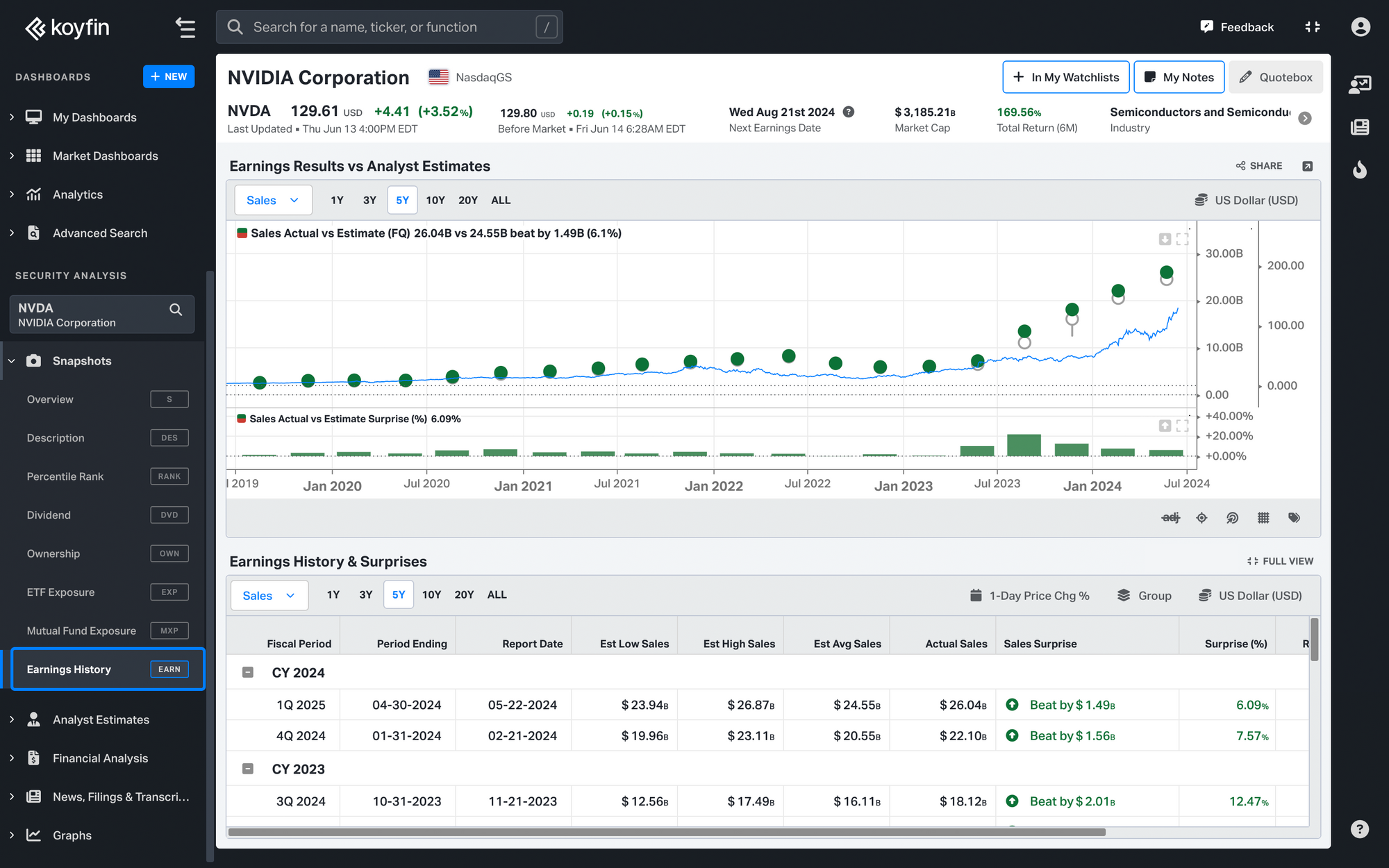
This feature shows how actual company performance compares to the previous estimates projected by analysts.
As an investor, this will help you understand the relationship between analysts’ expectations and how the stock has historically reacted. You can try out the new feature here.
Note: Earnings History & Surprises is available for equities only
Types of data covered
The snapshot is divided into two sections: the Earnings Results vs Analyst Estimates chart and the Earnings History & Surprises table.
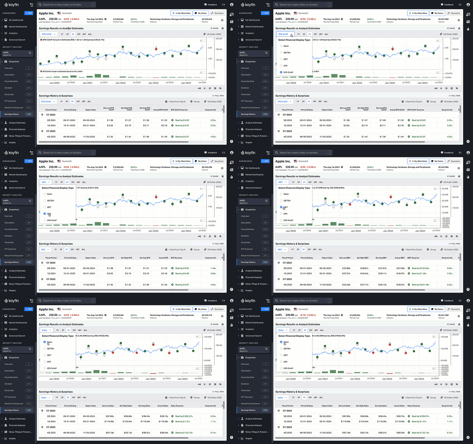
Each section has a dropdown list where you can choose different parameters to look at a company’s earnings results:
- Sales
- EBITDA
- EBIT
- EPS
- EPS GAAP

❗Note that “EPS” refers to the “pro forma” EPS where a company's management may choose to subtract some expenses like one-time items or options (ESOP) expenses. This may cause the EPS to vary significantly from EPS GAAP which shows EPS based on GAAP accounting rules.
Feature walkthrough
How does it work? Let’s take a sales performance chart as an example.
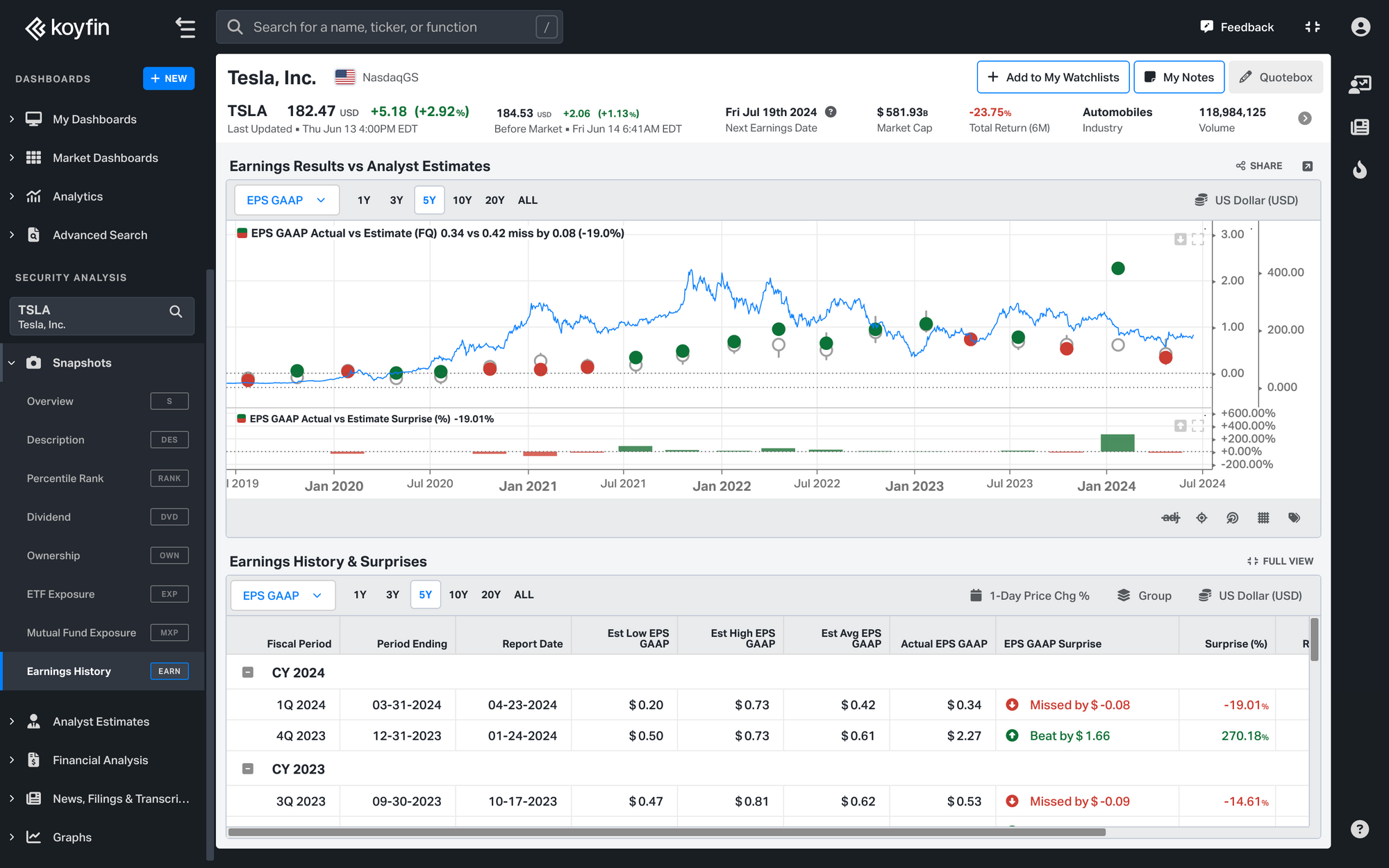
On the chart, the grey circle stands for the average sales estimate projected for that company, and the colored one shows actual performance.
If the circle is red, the sales missed on the average estimate for that quarter. If it’s green, the actual sales beat on the projected performance. The upper and lower wicks represent the highest and lowest estimated sales, respectively.
The blue line shows the stock price, where you can see the stock’s reaction to earnings. For instance, if a company misses earnings, its stock would probably be expected to drop, though you may also notice anomalies that you’ll want to investigate.

The Earnings History & Surprises table repeats all the data from the graph completing it with four additional metrics: Sales surprise, 1D Price Reaction, TTM, and EV/Sales.
Also, you can enable the full view to cover more periods.
To get more information on Koyfin functionality, take a look at other Help Center documentation or check out our YouTube channel.
