Scatter Plot as a Tab in Model Portfolios

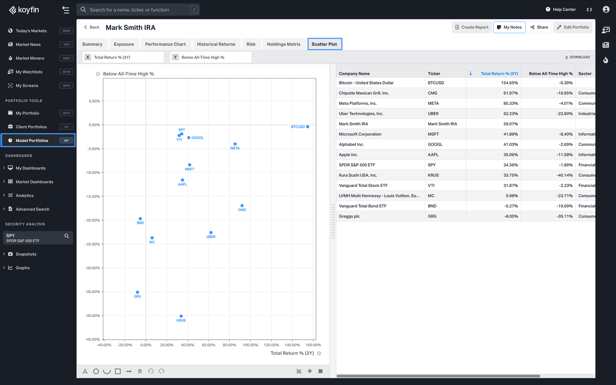
We’ve added a Scatter Plot tab in Model Portfolios to make it easier to compare holdings and analyze performance.
What it shows:
- Direct Holdings: Plot all direct holdings within the model portfolio for quick comparison.
- Portfolio as a Single Point: See the model portfolio’s overall performance represented as a single data point.
- Benchmark Comparison: Compare your portfolio to a selected benchmark, also displayed as a single data point.
Why it’s helpful:
- Focused Insights: Pick X and Y-axis metrics that matter to your analysis.
- Detailed View: Combine the scatter plot with a table for a complete understanding of your portfolio’s performance.
- Quick Comparison: Check how your holdings align with portfolio and benchmark goals.
Scatter Plot on Model Portfolios Homepage

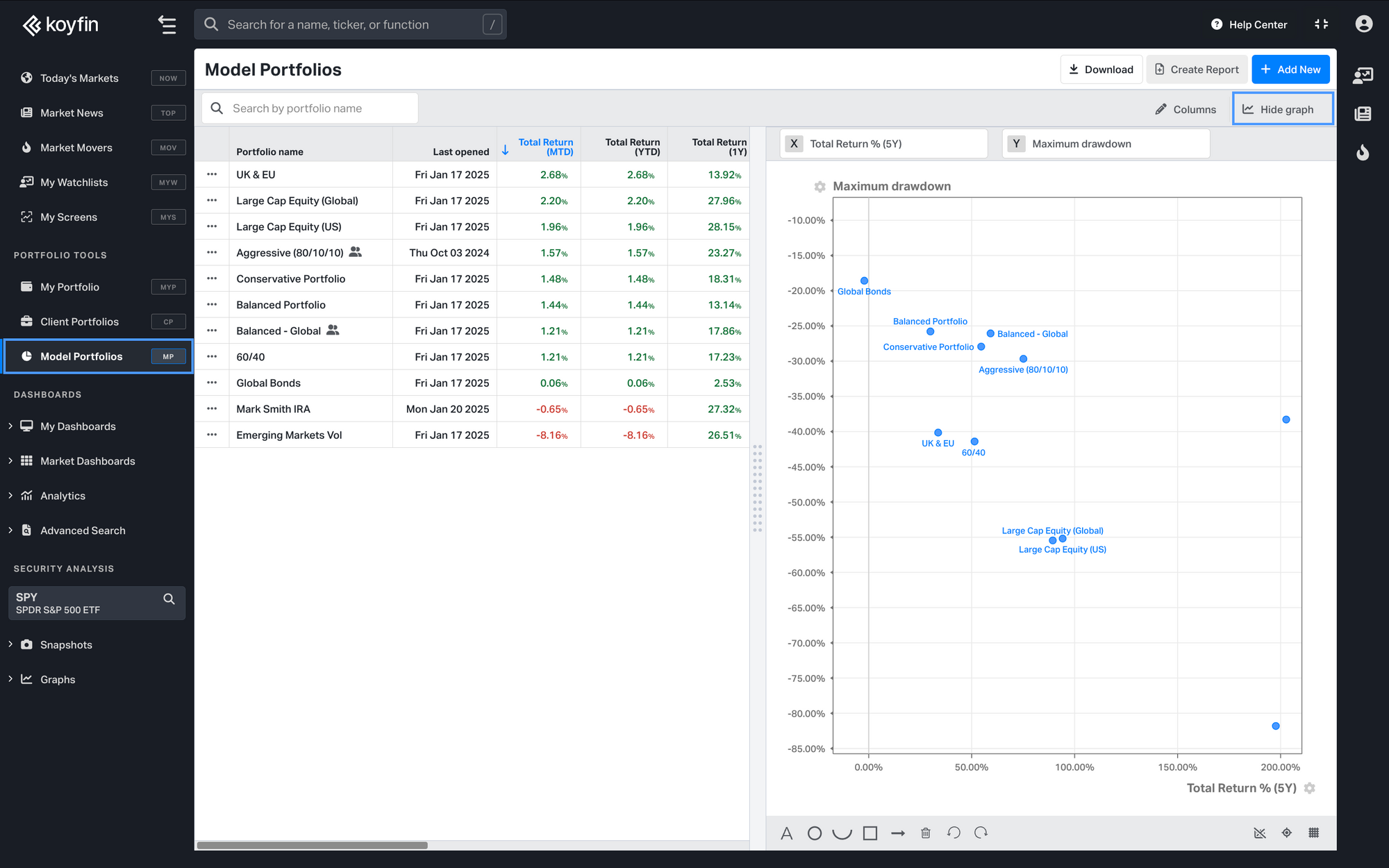
We’ve also added a Scatter Plot Chart to the Model Portfolios homepage to give you a quick overview of your model portfolio list.
What it shows:
- Portfolio-Level View: Each model portfolio is displayed as a single data point.
- Custom Metrics: Choose the metrics you want to analyze on the X and Y axes.
Why it’s helpful:
- Fast Comparison: Compare all your model portfolios in seconds.
- Clear Overview: Spot trends and relationships across portfolios at a glance.
Key Difference:
- Scatter Plot Tab: Focuses on individual holdings within a single portfolio and includes benchmarks.
- Scatter Plot Homepage Chart: Displays entire portfolios as single data points for high-level comparisons.
Watch our demo showcasing Model Portfolio Scatter Plot functionality:
