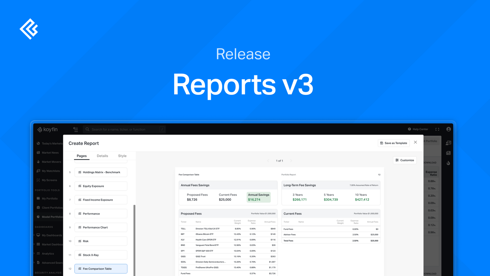
We've added new functionality to our reporting:
- Fee Comparison Table – Show clients cost differences between their current and proposed portfolios.
- Customization Options – Select key metrics and adjust inputs to tailor reports.
- Comparative Visuals – Compare Styleboxes and Asset Allocation side by side.
- Detailed Fee Breakdown – Fund Fees, Advisor Fees, and Total Fees are now displayed separately in the Comparison Summary.
Fee Comparison Table
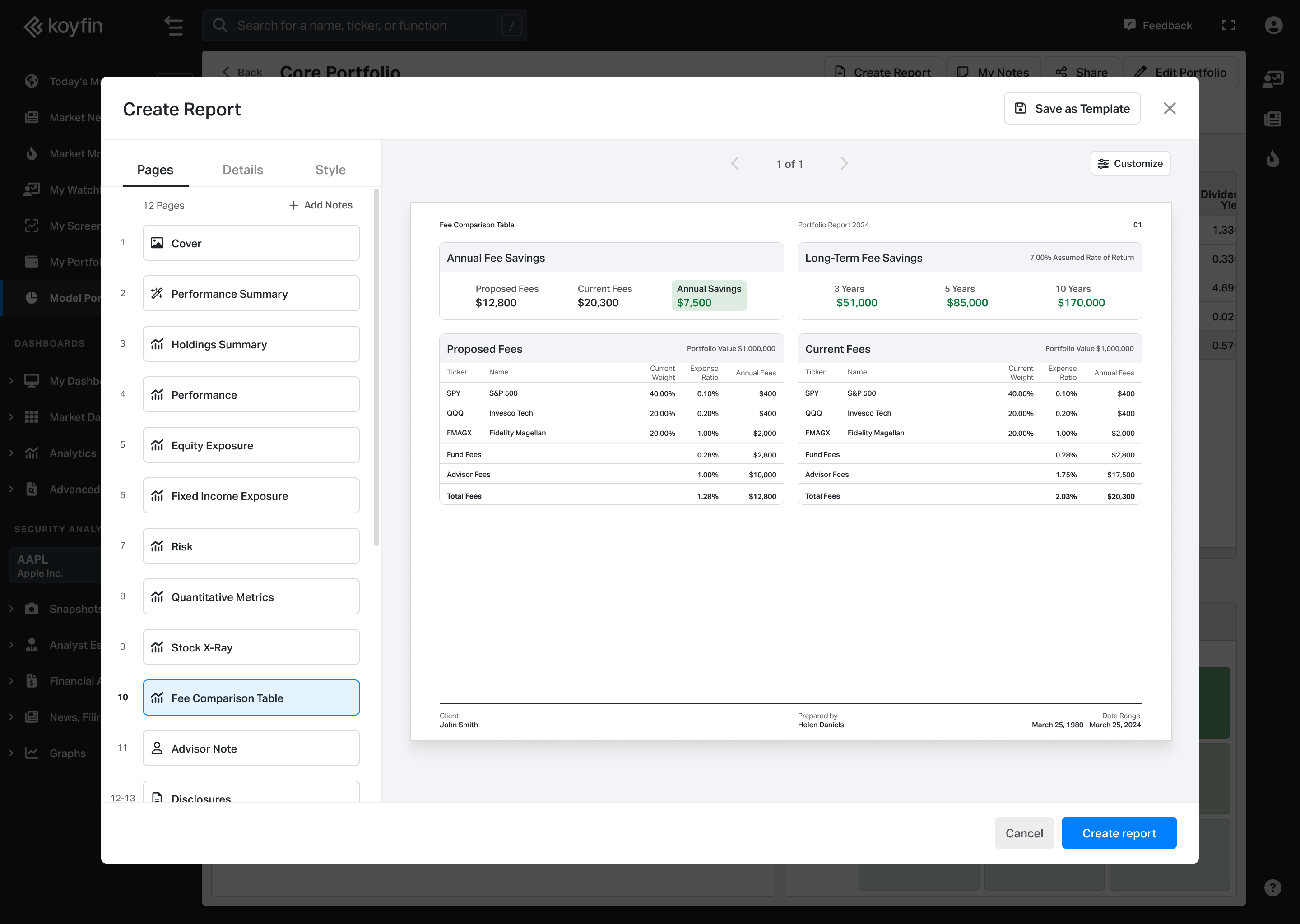
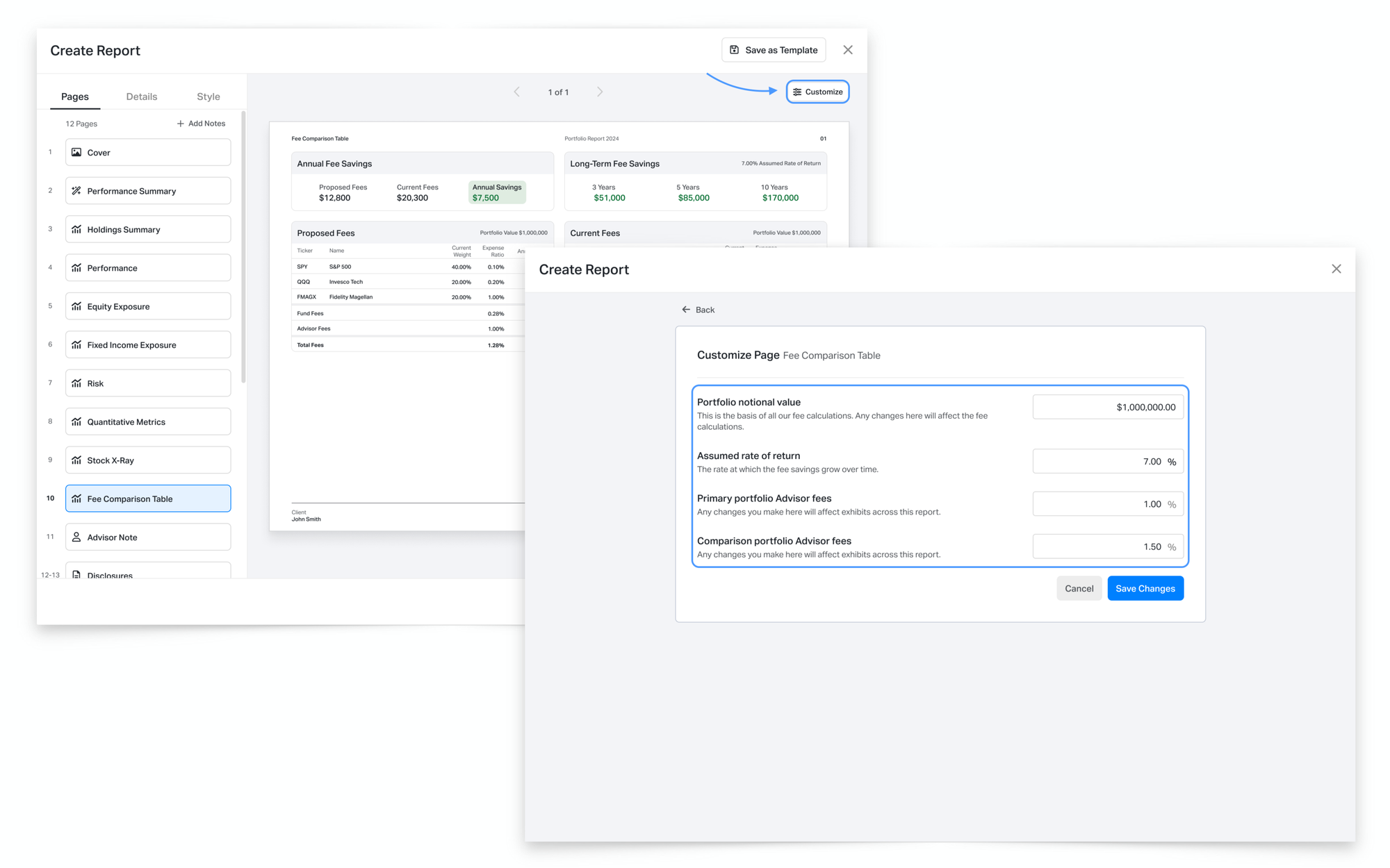
The Fee Comparison Table is a new exhibit in Reports that helps you compare fees between a client’s current portfolio and a proposed portfolio. It breaks down Fund Fees, Advisor Fees, and Total Fees in both percentage and dollar terms, making it easier to visualize cost differences and potential savings.
Click the Customize button in the exhibit to adjust:
- Portfolio Notional Value
- Assumed Rate of Return (default: 7%)
- Primary Portfolio Advisor Fees
- Comparison Portfolio Advisor Fees
Once saved, the exhibit updates to reflect the modified inputs.
More Customization Options
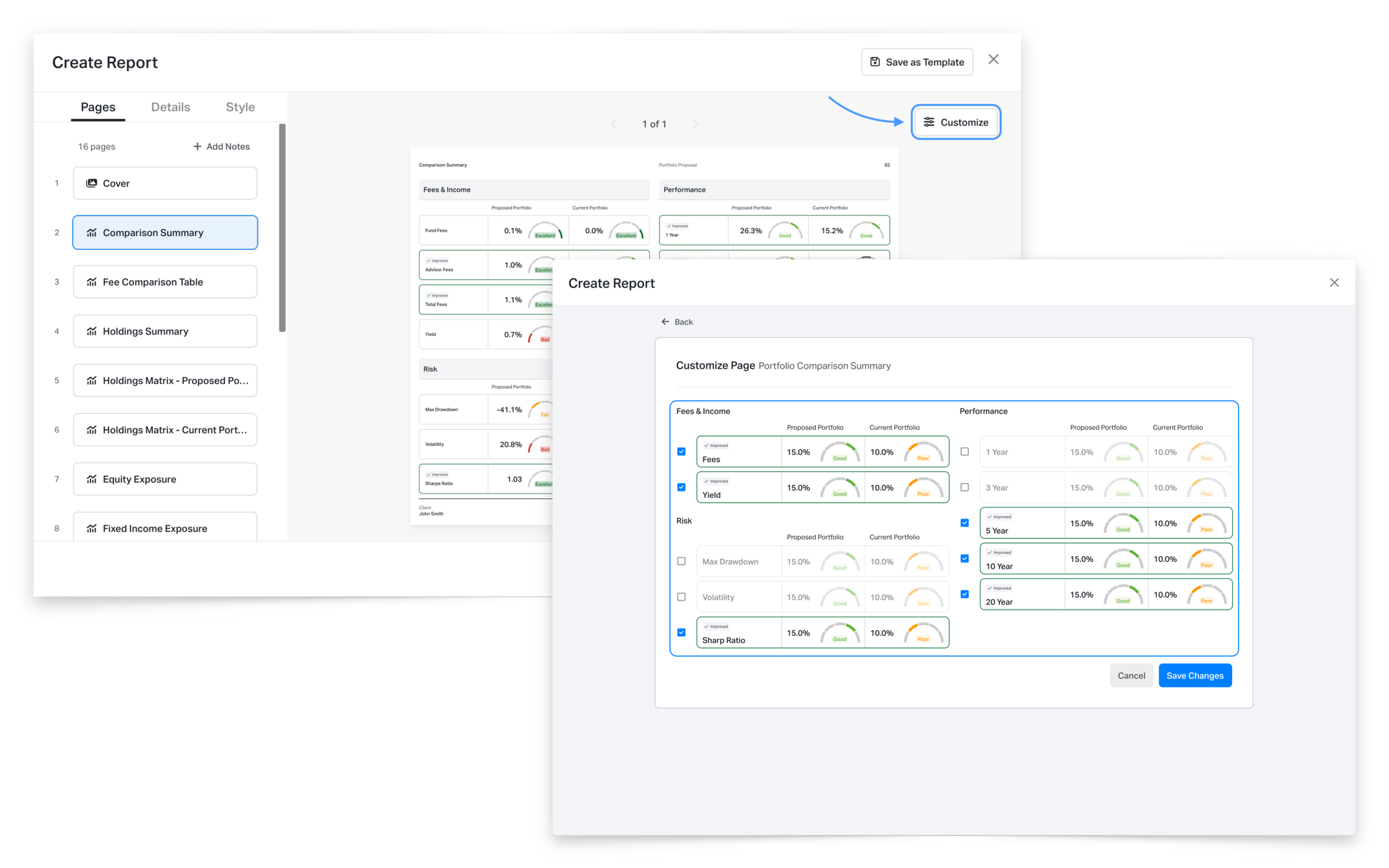
Comparison Summary Customization
The Comparison Summary exhibit is now customizable, allowing you to choose which metrics appear in the report. This helps you tailor reports to highlight the most relevant insights for each client.
How it works
- Click the Customize button in the Comparison Summary exhibit.
- A menu will open, displaying available metrics with checkboxes.
- Select or remove specific metrics based on your preferences.
- Click Save, and the exhibit updates to reflect your selections.
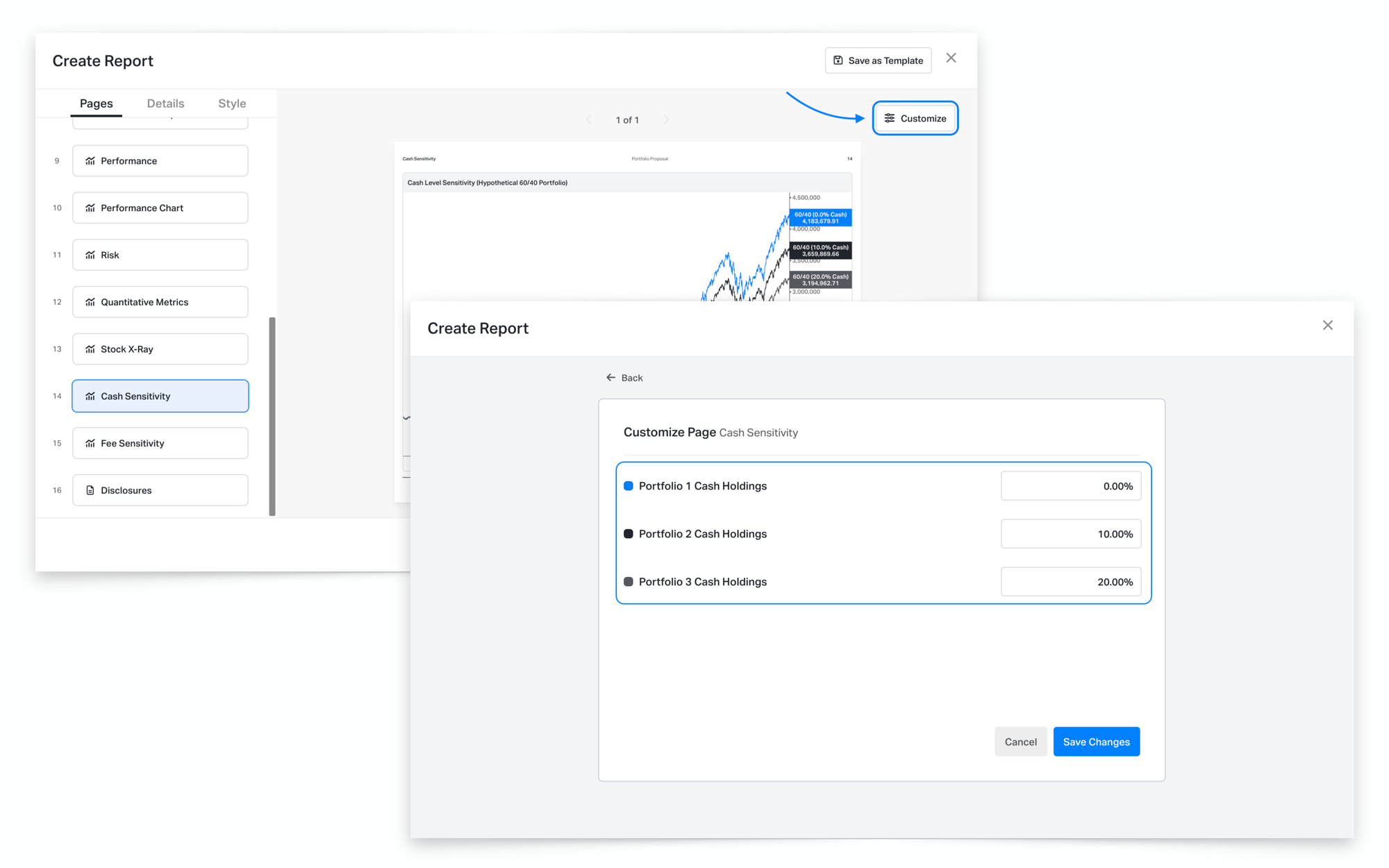
Cash & Fee Sensitivity Customization
The Cash Sensitivity and Fee Sensitivity exhibits now allow you to modify input values for a more tailored scenario analysis.
How it works
- Click the Customize button in either the Cash Sensitivity or Fee Sensitivity exhibit.
- Modify the following inputs:
- Cash Sensitivity – Adjust the cash allocation percentages displayed in the chart.
- Fee Sensitivity – Adjust the fee percentages displayed in the chart.
- Click Save, and the exhibit updates to reflect the modified inputs.
New Comparative Visuals
Equity & Fixed Income Comparative Stylebox
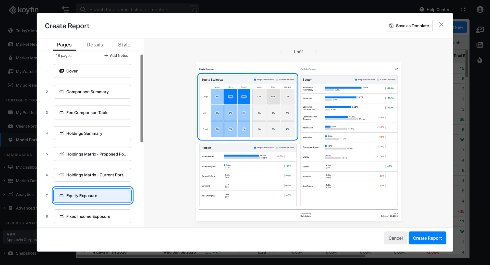
The Equity and Fixed Income Stylebox now allows side-by-side portfolio comparisons, making it easier to analyze investment style classifications. You can find it in the Equity and Fixed Income Exposure pages.
Asset Allocation Comparison
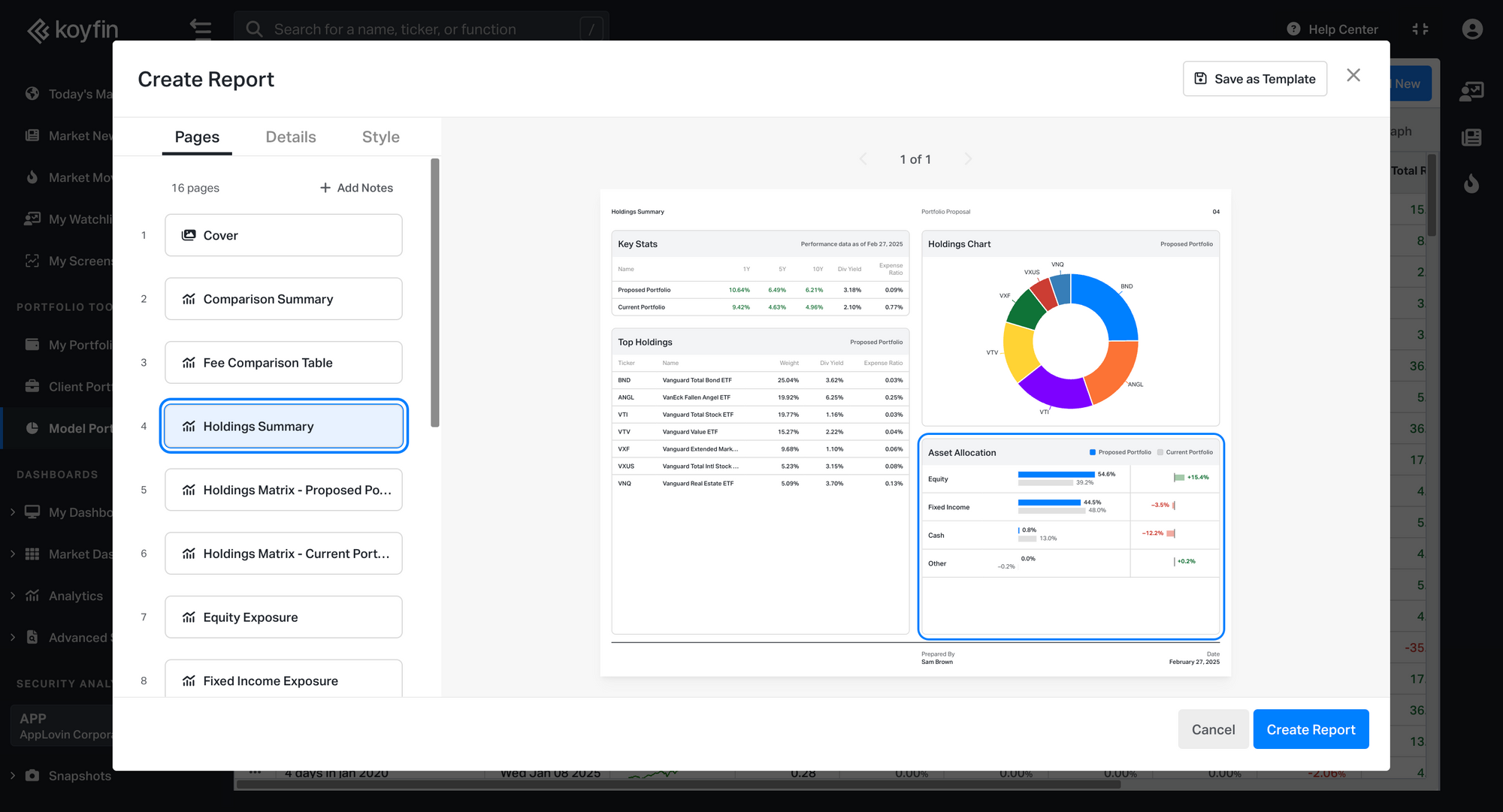
The Asset Allocation exhibit is displayed as a bar chart, allowing for a side-by-side comparison of asset distribution with percentage changes highlighted between a client’s current and proposed portfolio. It is available in the Holdings Summary page.
Detailed Fee Breakdown
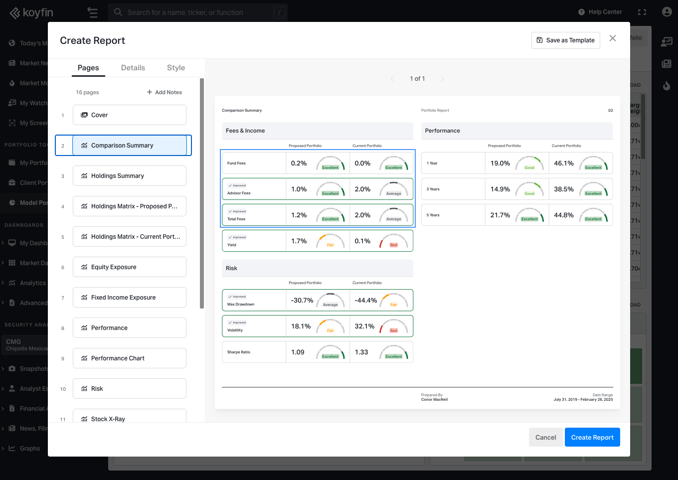
Fund Fees, Advisor Fees, and Total Fees are now displayed separately in the Comparison Summary page under the Fees & Income section, making it easier to compare portfolio costs and communicate fee structures with clients.
Watch our demo showcasing Reports v3 functionality: